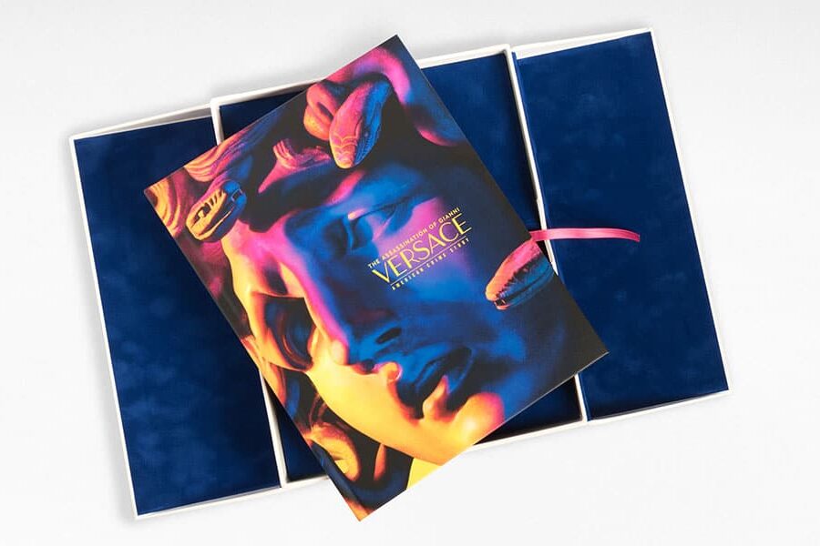
Your packaging is the presentation of your product and as a result, a representation of your company. That’s why it’s crucial to not just design packaging that’s appealing to consumers, but to create designs that reflect your brand.
Big, bold, and bright are the three packaging Bs that many brands have lived by. But eye-catching isn’t always the way to go. Among the technicolor insanity of modern packaging, a new trend has been born: simple packaging design.
Minimalist packaging design has taken the industry by storm, dominating retail industries like luxury products, cosmetics and fashion. But one of the best things about minimalist packaging is that it’s versatile, easily customizable, and can be used in virtually any industry. Here’s what you need to know.
The Rise of Minimalist Packaging Design
Minimalist packaging has exploded in popularity over the last few years. Growing attention to the unboxing experience and the impact of packaging on the environment has encouraged consumers to look at the practices of the brands they buy from.
According to the Sustainable Packaging Study, 92% of consumers said that biodegradable, eco-friendly, and minimalistic packaging is important to them when making purchasing decisions. The growing mainstream adoption of simpler packaging has turned traditional packaging design on its head.
In another study, 72% of Americans agree that the design of a package matters to their experience with a brand. In other words, product packaging is no longer just a collection of cardboard and paper that goes in the trash. It’s a marketing tool with the ability to boost brand awareness, brand recall, and customer loyalty.
Bigger brands have taken notice of this trend, with BMW simplifying its logo to adopt a minimalist approach. Christian Dior’s packaging and logo are iconic for their simplicity, exuding luxury in every aspect of their branding..
Approximately 40% of consumers will share photos on social media of products with packaging that appeals to them. Brands looking to transform their packaging have a chance to create an additional marketing channel on social media and capture that valuable word-of-mouth marketing everyone wants.
But brands need to tread carefully with how they alter their packaging. Making radical changes to adopt minimal packaging designs can pay dividends in the long run, but you must be wary of turning loyal customers off your brand.
For example, 50% of consumers said they would consider switching to a new brand if they change their iconic packaging design. Surveys and feedback from customers can give you a sense of how your customers feel about your current packaging, and whether or not a change would be welcome.
Your product packaging gives valuable information about what’s inside, communicates your values, builds credibility, instills trust, and represents your brand. Just because minimalist designs may produce more simple packaging certainly doesn’t mean the business benefits are simple.
6 Minimalist Packaging Design Tips
Minimalist packaging is more than a plain white box with simple black text on it. Minimalism is a difficult balance to find in the world of design, but with a few tips you can create a design that’s modern and reflects your brand.
If you’re interested in moving towards minimalistic packaging designs, here are some tips for nailing that perfect design.
1. Make it Monochrome
Growth in monochromatic design was named one of the leading design trends in 2021, and it’s easy to see why.
If your company has a unique brand color or shade that makes people think of you, incorporate it into your packaging. For example, Tiffany’s uses that iconic teal blue across its packaging and social media pages. This is a great example demonstrating that when it comes to minimalism, packaging doesn’t have to be white or neutral tones.
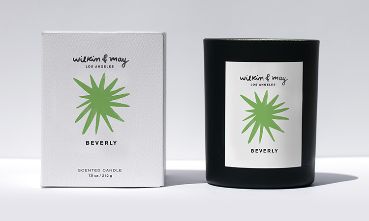
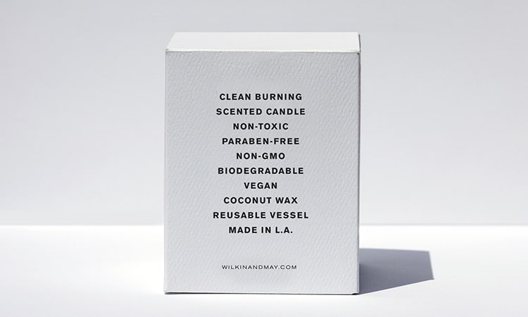
However, there’s nothing wrong with choosing white in order to elevate your brand. The color white in the packaging design communicates positivity and purity. Dr Barbara Sturm skincare is a brand that uses white boxes to communicate simple luxuries.
2. Place Emphasis on Your Logo
The art of minimalism packaging means focusing only on what’s necessary and nothing more. One of the biggest benefits of minimalist packaging is that it often draws more attention to your branding, such as your logo.
A box with nothing but your logo is a great way to draw attention to your brand. With nothing else getting in the way, your customers are more likely to remember your logo and have greater brand recall. It’s the key to staying identifiable and recognizable.
SIX-REALMS is a perfect example of minimalist packaging emphasizing the logo. They have only included their logo with gold foil stamping on a plain monochromatic background. The gold shines and shimmers in the light, creating a natural focal point. It also aligns with Six Realm’s sleek and sophisticated brand values.
3. Use Texture
A multi-sensory experience defines great unboxing experiences. Smooth, glossy packages have been the industry standard, but minimalist packaging has thought outside the box. Many minimalist designs incorporate multiple layers, raised edges, dabbled paper materials, and even mimicking the feeling of natural materials (like wood or grass).
Adding texture creates even more of an immersive unboxing experience and can help you communicate your brand values. For example, simulating the feeling of wood can give off all-natural, organic vibes. While using high-quality, textured paper materials can give off an air of sophistication and luxury. Bringing some texture to your designs is a simple way to stand out from the crowd.
4. Go for Sleek Lines
Sleek lines send a message about your brand: that you value art, culture and design. The Art Deco art movement of the 1920s was one of the first instances of industrial minimalism, during which designers started looking at how lines were used in a three-dimensional setting.
Adding sleek lines to your design is still a tried-and-tested way to catch the eyes of your customers. They show that you’ve put the time and effort into designing something sleek, sophisticated and modern for your products. These are great for luxury products like cosmetics and fashion.
5. Go Green
The environment is top of mind for the modern consumer. Did you know that 43% of U.S. consumers listed sustainability in packaging design as very or extremely important?
Scientists are experimenting with creating friendlier packaging materials for the environment. Compostable packages are just one of the innovations in recent years, and are well worth the investment to boost your brand image.
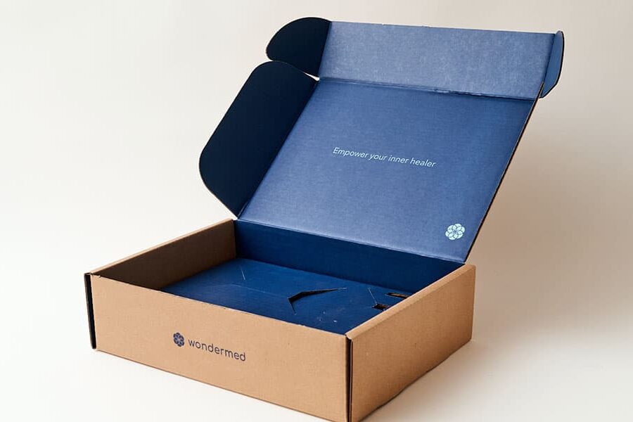
Kraft boxes are an affordable eco-friendly solution for your packaging design. Chezza is one brand that uses kraft boxes. Using only the box, which is 100% recyclable, and soy-based ink, they have added a cut-out window to make the packaging ideal for display on retail shelves.
In addition to making your designs minimalist, pack products into boxes that are specifically for your products. Reduce wasted space and avoid adding anything that doesn’t need to be added.
6. Choose Simple Fonts
Any minimalist packaging design sends a message of simplicity and efficiency. The fonts you use on your boxes should reflect this. Simple fonts are those that avoid elaborate, cursive lettering and fancy swirls. Simple, block-style fonts get to the heart of the matter. They’re no-fuss and no-hassle, easy to read, and simple to design.
Examples of minimalist fonts include:
Playing around with typography is crucial to finding the right fit for your brand. However, you should also ask your customers what they like through surveys and A/B testing. With thousands of fonts to choose from, start with a shortlist and work your way through it.
Bring Your Design to Life with D’Andrea
Now that you have some inspiration, you can begin designing your minimalist packaging. Don’t be afraid to combine minimalist principles with your brand’s vibe — that’s how you’ll stand out to customers!
At D’Andrea Visual Communications, we can help you create custom packaging that communicates your brand values and stands out from the crowd. Already have a design in mind? We can make it happen! Have no idea where to start? Work with our team to create the perfect design for your branding needs. D’Andrea Visual Communications has the knowledge and expertise to enhance your design.
