Businesses are becoming more aware of the power of quality packaging. While the primary goal of most packaging is to protect its contents, it should also be utilized to engage customers and make your products stand out from the competition.
The designs that consumers prefer today hint at the significance of innovative packaging, which can range from simple, subdued colors to quirky accents that liven things up.
Packaging is a significant factor in consumers’ first impressions of a brand. Unfortunately, many new businesses may be tempted to cut corners in this area to save money. However, ignoring creative packaging designs can be costly and affect your company’s reputation, customer experience, and bottom line.
Discover why creative packaging is essential and how to make a statement with your packaging designs.
Why Does Packaging Matter for Your Brand?
It’s common to think that the product you’re selling is more important than the packaging, overlooking its importance. This is a big mistake, as packaging is one of your greatest assets and can really uplift your brand.
Remember, your packaging is the first thing customers see when they unbox your product. When you use the right creative packaging, your brand is more noticeable in the marketplace, boosting your overall growth and success.
It’s critical to focus on the small details of your product, from its packaging, design, and placement on a store’s shelves. A company’s marketing efforts can also benefit from packaging options that are both innovative and sustainable, which in turn, reduces shipping and storage expenses.
Here are the main reasons that creative packaging ideas for products can influence the bottom line:
Brand Reinforcement
Consistently reinforcing your brand is a crucial part of any creative packaging ideas.
The sooner your market learns to recognize your brand, the more exposure they need to other brand elements like your logo, messaging, and company tagline.
Studies have found that customers must be exposed to your brand five to seven times before they start to recognize it. The first encounters with your brand matter. Consistency in branding between digital and physical assets is crucial for building recognition.
In many cases, the product’s packaging will serve as the consumer’s initial impression of the brand. The creative packaging your product comes in also sets you apart from the competition.
Design elements that make your product stand out from the crowd include a custom font, hand-illustrated artwork, and even recyclable packaging.
Product Protection
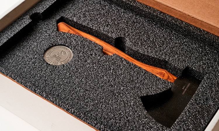
Sustainability, vintage-inspired logos, and simple packaging are all current packaging trends that can help your items stand out.
However, quality, safe packaging is still of utmost importance, especially in this day and age when every customer can leave an online evaluation of your products.
You can have the most effective marketing campaign ever, but if your products are damaged in transit or on the way home from the store, no amount of creativity will save you.
Increases Shareability
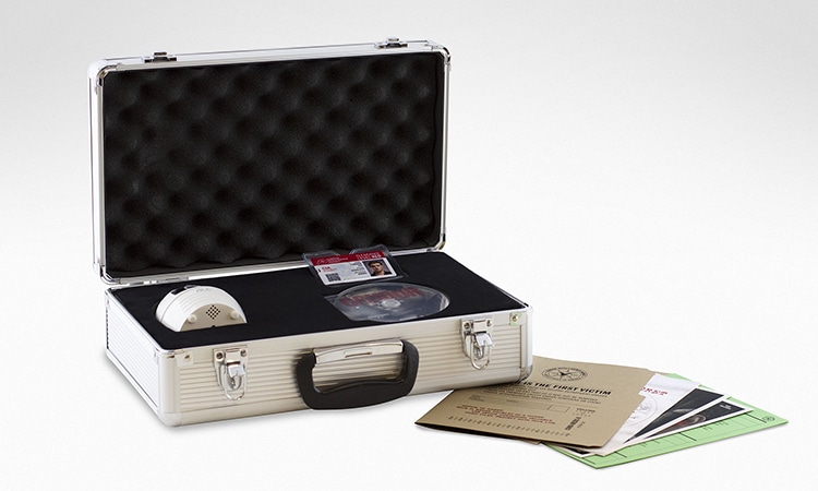
We are still in the era of social media influencers, and they still strongly sway public opinion. It would be a missed opportunity to not share products with influencers and leverage their viewers.
The packaging you use can be seen by thousands of people thanks to unboxing videos and product hauls. According to Google Shopping statistics, YouTube videos with the words “unboxing” in the title were watched over 20 billion times in 2021.
You should give as much thought to the packaging of your product as you do to the product itself.
Ensure your packaging reflects the aesthetics that will entice its intended audience to make a purchase and recommend it to their social networks.
Having professional-looking packaging might help you attract more customers and boost your sales.
We recommend that you provide influential people in your field with free samples of your best-selling products. Make sure your packaging is well-designed, consistent with your brand, and ideally features links to your social media pages.
Establishes Brand Quality
Consumers can learn more about the “experience” that your items provide by observing the packaging of your products.
Despite being taught not to judge a book by its cover, customers actually rate a business based on the quality of its packaging. They will not view you as a pioneer in your field if you employ low-quality and cheaply-made packaging materials.
They will seek someone else’s product if they don’t think you’ve put much effort and imagination into the design.
In the consumer-packaged goods sector, clear packaging offers an opportunity to communicate with customers.
Showing that you care about your customers and providing them with high-quality products can encourage them to interact with your brand in a hashtag and join the conversation.
Creates an Emotional Bond
Finally, remember the importance of color psychology while creating your packaging.
The right choice of colors can indeed evoke a strong reaction from your target audience. To illustrate, the color red has been shown to convey both vitality and urgency. For this reason, many food and fitness supplement brands incorporate red into their products and packaging. Colors like blue and green are great for eco-friendly cosmetics because they make people think of nature.
Your target demographic will more easily connect with your business if you use certain fonts and even central images on your package.
An emotional connection like this turns customers into promoters of your brand.
10 Creative Packaging Designs
Whether your goal is retention or brand awareness, here are 10 packaging ideas to spark inspiration:
1. Elegant Minimalism
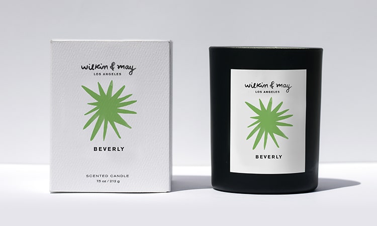
When brands achieve an elegant yet minimalist look in their design and brand communication, it catches the eye.
Minimalist packaging designs don’t include graphic elements that will distract individuals from the central focus: the packaging.
Keeping things minimal is a safe bet regarding logos, packaging, websites, and ads. However, there’s more to minimalist packaging than clean aesthetics.
It’s worth stressing that going with a minimalist approach to package design isn’t something that should be rushed into. You must learn your target market and what motivates them.
While there is no single “correct” approach to minimalist packaging, there are some guidelines to follow:
- The core principle of minimal design is restraint. Keeping your design focused on the essentials is imperative. This could include coming up with clever ways to keep messages brief or selecting graphics that can convey more than one message.
- Choose one thing to emphasize. To grab the attention of buyers, minimalist packaging should have no unnecessary elements. For instance, the logo and packaging color shouldn’t be overshadowed by a high-resolution image of the product. One key feature should be highlighted to the customer.
2. Bright and Fun
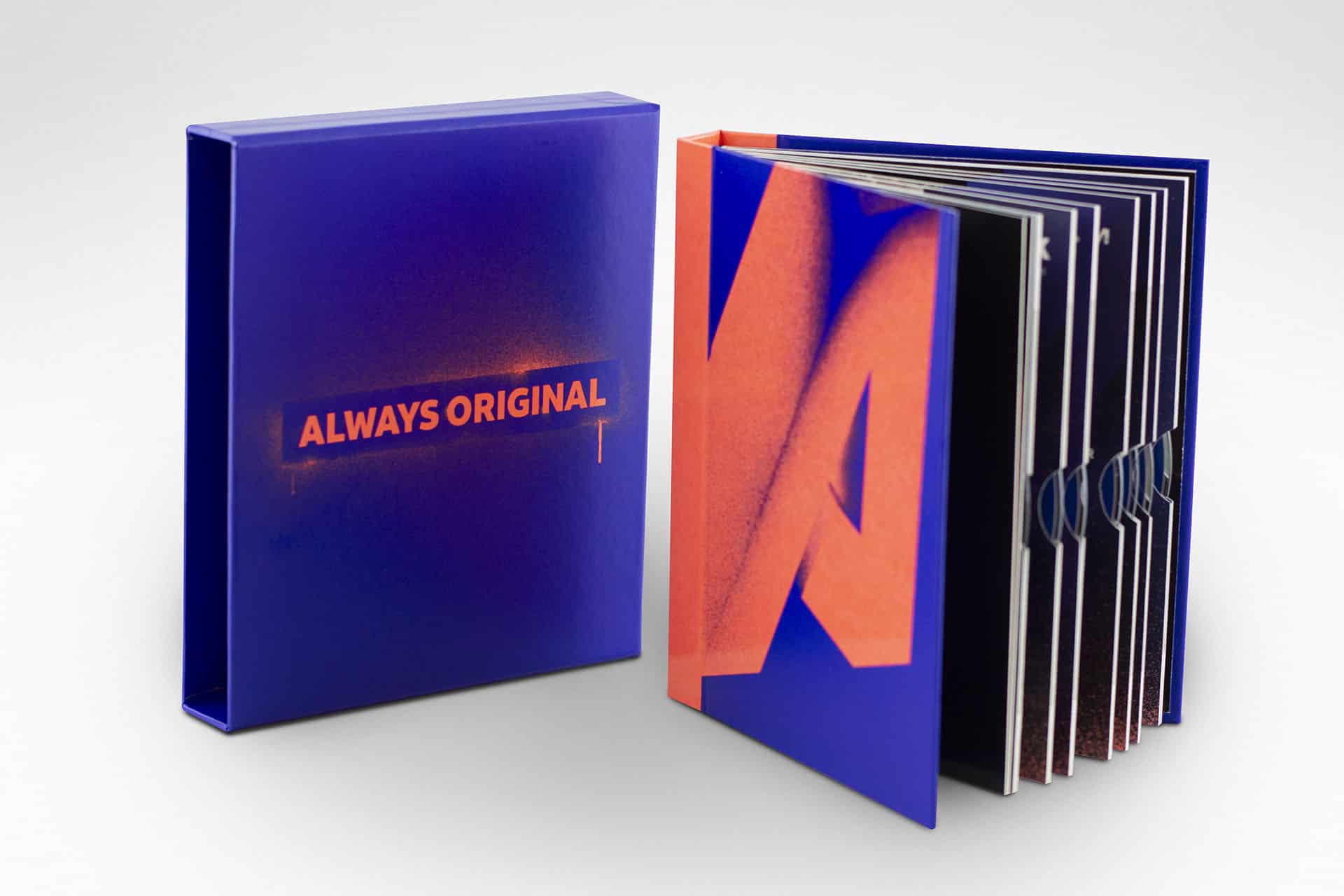
Even though there are many factors involved in creating a polished product, color theory is often overlooked. Consumers’ purchasing decisions are influenced by the colors they see.
In fact, every well-versed marketer will tell you that color is crucial when it comes to designing packaging.
Color has been put to use in new and exciting ways by designers in recent years. Choosing a primary hue for your design may seem like a creative choice, but it actually has a profound effect on how viewers interpret your work.
Select a hue that conveys the spirit of your company, is aimed at your target audience, and isn’t afraid to take risks.
3. Eco-friendliness
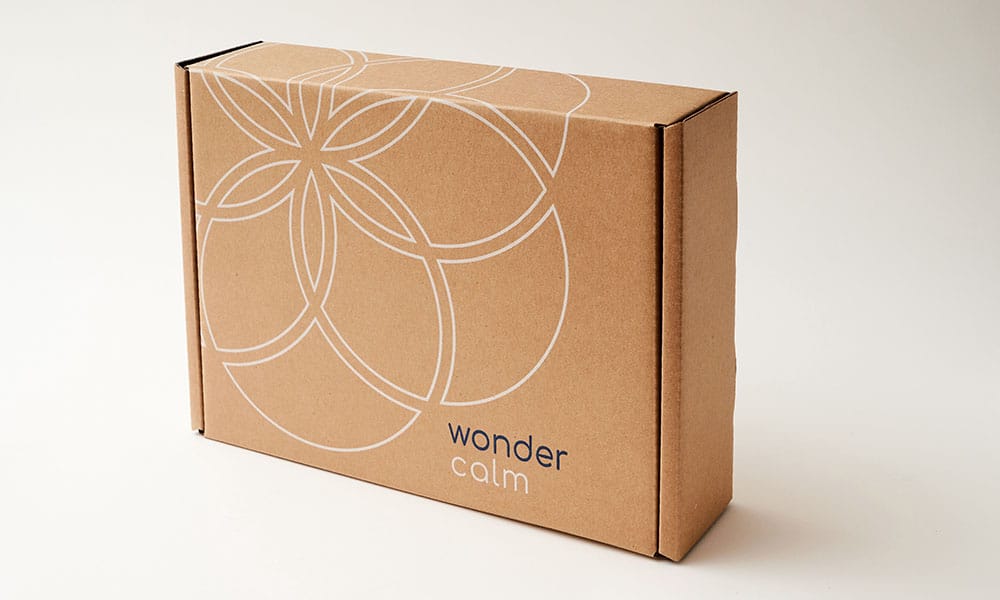
Sustainable, regionally produced, and easily decomposed. Your packaging design can be environmentally conscious.
We’re big fans of the sustainable packaging movement because it tends to usher in designs that are both modern and grounded in nature. Feeling good about helping the environment is reinforced by the aesthetic value of using recycled products.
Brands and designers are collaborating to increase the use of sustainable materials and the longevity of recyclable components. There is also a growing movement among shoppers to support companies that make an effort to reduce their environmental impact.
The eco-friendly movement has a significant effect on the environment. It helps people and businesses save money, so it’s a win-win for your packaging design.
4. Clever and Cute
Do you want to give your cool packages a cute and inviting appeal?
Creative product promotion ideas include using the packaging itself as a display. Cutouts or die cuts, a major trend in package design, are an excellent method to convey to the consumer that you are confident in the look of your product and can have fun too!
Using cutouts or die cuts can promote tactile engagement or simply improve its aesthetics.
A clever and cute packaging style will make customers take a second look at your creative boxes in the mail or through your storefront windows.
5. Suppleness and Texture
Adding texture and a dynamic, engaging effect to your packaging design is as simple as selecting a set of repeating patterns. Generally, this style of packaging will be picked up and held more often because of the repeated design element.
Using a recurring visual motif is a great approach to putting your brand’s style front and center. Your pattern could be sweet and delicate, or it could be daring and unique. Some or all of it could be made up of redundant passages of text.
In either case, you’ll convey a clear message to your target market about who you are and what they can anticipate from your product. In terms of presentation, it’s hard to beat this!
6. Whimsical Wonder
Appeal to your customers’ inner child by using vivid colors, eye-catching images, and entertaining graphics for unique packaging.
Adding whimsical artwork and graphics to your packaging will transport buyers to a world of imagination. Use sophisticated concepts depicted in novel ways without fear; the ensuing astonishment and awe will make your packaging unforgettable.
Your packaging graphics will really stand out with some hand-drawn logos and images in bright, eye-catching colors. Make a splash with your audience by going in this exciting design direction.
7. Pulling on Heart-Strings
Designers want to flex their creativity and have been able to do it using the coolest packaging designs that incorporate handwritten-style typography.
Many consumers are moved by materials that appear handwritten or has a homemade touch. You may remember enjoying certain types of handwriting from your high school or college days.
This comfort can make you think of your mom’s spaghetti, made with care and served at a special family meal. It feels like home.
There is no surer way to get a customer’s attention than by appealing to their emotions through handwriting. Including handwriting in your marketing materials is an excellent approach to making customers feel a sense of nostalgia and connect with your goods.
8. Form Fits Function
Adding functionality to packaging is a great way to boost sales and delight customers.
One of the primary goals of functional packaging is to remove any obstacles to a sale.
Bonus alternate uses can give customers pleasant surprises and enhance the product’s primary function. This can be a simple exercise of including a built-in spoon to a yogurt cup or having measuring guides printed on a box of brownie mix.
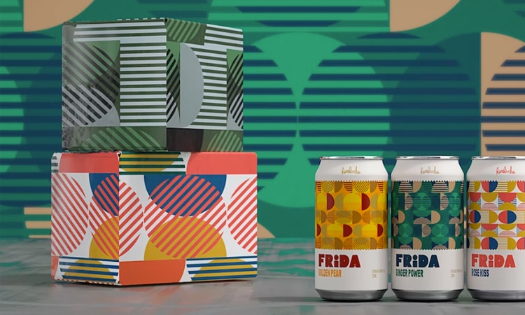
9. Shapes and Patterns
A package’s visual and tactile qualities contribute to the product’s visual identity. When people arrange shapes in a certain way, they begin to see patterns and connect with experiences in their lives.
Shapes and patterns impact consumers’ perception of products. It’s vital to remember that different people respond emotionally and uniquely to various forms and patterns. The human eye is drawn to certain visual cues.
Shapes have a wide range of expressive potential. Among some groups, many shapes, such as stars, convey profound symbolic meanings. Designers typically work with either geometric or organic forms. While organic shapes feel more natural, geometric shapes have a more organized quality. Geometric shapes are often drawn using design software, while organic shapes are typically drawn more freely.
10. Touch and Feel
Consumers’ responses to tactile and haptic touch tests emphasize the importance of touch, shape, texture, and feel to brand recognition and customer preference. When people associate a name with feelings and principles, they engage in a complex web of multisensory interactions.
While the texture is undoubtedly part of this approach, you also want to consider the haptic feedback that your customers will have when handling your package.
Just as many of us have fond memories of flipping through a book, you can build a cognitive resonance with consumers by having a cool packaging design with a unique opening experience.
Get More Eyes on Your Brand with D’Andrea Visual Communications
Now that you’ve seen how easy it is to make genuinely creative packaging designs, you shouldn’t be afraid to go all out with your product’s presentation. Creative and inspiring packaging is a significant part of the customer experience and increases the likelihood that a product will sell.
Whether you need to create custom packaging or influencer boxes, we have the experience and knowledge to take it to the next level.
